| View previous topic :: View next topic |
| Author |
Message |
Raw Hammer


Joined: 11 Sep 2008
Location: The Gutter
|
| Post subject: |  |
|
Hang on, you WANT sponsors logos on your apparel?
Why would you want to be a walking billboard? It�s why our (AFL) gear looks so awful. The coache�s polo shorts are atrocious.
_________________
Est. 2002 |
|
|
|
 |
K
Joined: 09 Sep 2011
|
| Post subject: | |
|
| Raw Hammer wrote: | Hang on, you WANT sponsors logos on your apparel?
Why would you want to be a walking billboard? It�s why our (AFL) gear looks so awful. The coaches polo shorts are atrocious. |
Maybe the coaches should "suit up with Wolf Kanat". Maybe WK aren't paying the club enough. |
|
|
|
|
Piesnchess
piesnchess
Joined: 09 Jun 2008
|
| Post subject: | |
|
NEW Logo sure as hell wont win us the Flag !
_________________
Poverty exists not because we cannot feed the poor, but because we cannot satisfy the rich.
Chess and Vodka are born brothers. - Russian proverb. |
|
|
|
|
RudeBoy
Joined: 28 Nov 2005
|
| Post subject: | |
|
Purely from a marketing perspective, I feel this new logo and the way the club promotes itself on line, significantly diminishes our brand.
We are a Football Club. We are the Collingwood Football Club and we have been for 125 years. By bringing in Women's football and Netball in under a generic umbrella brand of Collingwood, and abandoning our identity as the CFC, we do ourselves a disservice.
I follow Liverpool FC in the Premier League, and they have a women's team as well, but the club is and always be Liverpool FC. The women's team, like the u23 and youth academy teams, are simply minor parts of Liverpool FC.
FFS Eddie, please show some common sense and respect for the history of our great club. Return our name to the Collingwood Football Club (CFC). |
|
|
|
|
BHPIE
Joined: 02 Oct 2004
Location: Broken Hill
|
| Post subject: | |
|
| Agree rudeboy, l think its more about the addition of the netball team more than the womens footy team,and l HATE the new logo, what next ,will we be called Sporting Collingwood or the Collingwood sports club, , we are getting to forget our roots , that is a disaster waiting to happen |
|
|
|
|
HAL
Please don't shout at me - I can't help it.

Joined: 17 Mar 2003
|
| Post subject: | |
|
| How much more could it be? |
|
|
|
|
K
Joined: 09 Sep 2011
|
| Post subject: | |
|
| RudeBoy wrote: | Purely from a marketing perspective, I feel this new logo and the way the club promotes itself on line, significantly diminishes our brand.
We are a Football Club. We are the Collingwood Football Club and we have been for 125 years. By bringing in Women's football and Netball in under a generic umbrella brand of Collingwood, and abandoning our identity as the CFC, we do ourselves a disservice.
I follow Liverpool FC in the Premier League, and they have a women's team as well, but the club is and always be Liverpool FC. The women's team, like the u23 and youth academy teams, are simply minor parts of Liverpool FC.
FFS Eddie, please show some common sense and respect for the history of our great club. Return our name to the Collingwood Football Club (CFC). |
Let's just hope we're never referred to as the Collingwood Franchise. If we are, it might signal the end times... |
|
|
|
|
K
Joined: 09 Sep 2011
|
|
|
|
|
Raw Hammer
Joined: 11 Sep 2008
Location: The Gutter
|
| Post subject: | |
|
New Eagles logo is OK. Looks too much like Hawthorn�s though, with the fanned neck feathers. Eye could look a bit more imposing, too.
But it�s thick lined, simple, and will look good on apparel and in digital. Not like our new logo�s thin outlines that merge into a murky black mess.
_________________
Est. 2002 |
|
|
|
|
Raw Hammer
Joined: 11 Sep 2008
Location: The Gutter
|
| Post subject: | |
|
It�s definitley modern, but far from �fierce� as the headline would suggest. What a miss with the eye. It�s just a half hearted �meh� look in its eye. What an absolute miss.
_________________
Est. 2002 |
|
|
|
|
K
Joined: 09 Sep 2011
|
| Post subject: | |
|
| Raw Hammer wrote: | New Eagles logo is OK. Looks too much like Hawthorn�s though, with the fanned neck feathers. Eye could look a bit more imposing, too.
But it�s thick lined, simple, and will look good on apparel and in digital. Not like our new logo�s thin outlines that merge into a murky black mess. |
I was actually going to ask what's the difference in appearance between an eagle and a hawk. |
|
|
|
|
Jezza 
2023 PREMIERS!
Joined: 06 Sep 2010
Location: Ponsford End
|
| Post subject: | |
|
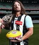
The logo on both jumpers is too big and detracts from the overall look of the jumpers. I didn't mind it this year as a one-off for our 125th anniversary, but I was hoping it wouldn't become a permanent addition for the foreseeable future.
I welcome the return of the pinstripes on our clash jumper, but pity they were not introduced on our home jumper as well. As I've said for a number of years, I wish we returned to a predominant white with black stripes as our home jumper.
I felt that with the club rebranding itself somewhat, this would have been the right time to make the change, as I feel the current home jumper has become stale and is too synonymous with the McGuire era.
I agree with another poster here that a number panel would look great.
_________________
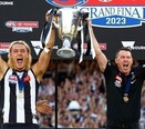
| 1902 | 1903 | 1910 | 1917 | 1919 | 1927 | 1928 | 1929 | 1930 | 1935 | 1936 | 1953 | 1958 | 1990 | 2010 | 2023 | |
|
|
|
|
uncanny
Joined: 04 Mar 2014
Location: Castlemaine
|
| Post subject: | |
|
All good I reckon after a bit of sad about goodbye to the oval football club boundary on the latest incarnation of the emblem since 92.
It's gotta happen.
We are one club now with women playing footy and netball.
Their success is our success. It will make us stronger. It's the only way we'll see "floreat pica"
_________________
woodsmen rule |
|
|
|
|
slangman
Joined: 11 Aug 2003
|
| Post subject: | |
|
| Jezza wrote: |
The logo on both jumpers is too big and detracts from the overall look of the jumpers. I didn't mind it this year as a one-off for our 125th anniversary, but I was hoping it wouldn't become a permanent addition for the foreseeable future.
I welcome the return of the pinstripes on our clash jumper, but pity they were not introduced on our home jumper as well. As I've said for a number of years, I wish we returned to a predominant white with black stripes as our home jumper.
I felt that with the club rebranding itself somewhat, this would have been the right time to make the change, as I feel the current home jumper has become stale and is too synonymous with the McGuire era.
I agree with another poster here that a number panel would look great. |
I love how the logo is on the jumper.
_________________
- Side By Side - |
|
|
|
|
T2 
T2
Joined: 07 Jun 2016
Location: Bendigo
|
| Post subject: | |
|
| swoop42 wrote: | I was looking at updating my Collingwood waterproof jacket from the decade old Adidas one I currently have but the one available currently is just so bland and all black outside some emblems. It doesn't even have our sponsors on it to add some colour or white stripes.
Would it kill the club to stop making everything predominantly black or black and light grey.
Our colours are black and WHITE and as a collective our supporters stand out better in the crowd and on tv when it isn't just a see of black.
I'm hoping the 2018 version will be better visually. |
Agree wholeheartedly, Swoop, and have been thinking the same thing for years. The last I recall our member shirts and caps being anything but all black (in fact, I think they were completely the opposite i.e. white) was 2010. Would love a bit of that "colour" back in our gear. |
|
|
|
|
|